
In today’s fast-evolving digital landscape, the integration of Artificial Intelligence (AI) has...
Users now interact with websites on a wide range of devices, from smartphones and tablets to laptops and desktops. Ensuring a consistent and engaging experience across all screen sizes is essential, not just an added advantage. At Tristate Designs, we understand the importance of responsive web design in enhancing user experience and optimizing website performance. Let’s explore why adapting to different screen sizes is crucial and how it can make your website stand out in a competitive market.
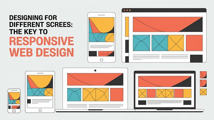
What is Responsive Web Design?
Responsive web design (RWD) is an approach that ensures a website’s layout adjusts seamlessly to various screen sizes and resolutions. The main goal is to provide an optimal viewing experience, whether someone is using a small smartphone screen or a large desktop monitor. A responsive design automatically resizes, hides, shrinks, or enlarges elements on a website to make it look good on any device.
Why is Responsive Web Design Important?
- Enhanced User Experience: A responsive design ensures that users have a pleasant experience, regardless of the device they use. They can navigate easily without pinching, zooming, or excessive scrolling, leading to increased time spent on your site.
- Improved SEO Performance: Search engines like Google prioritize mobile-friendly websites in their rankings. Responsive web design helps your site perform better in search results, driving more organic traffic and potential leads.
- Cost-Effective Maintenance: Maintaining a single responsive website is far more cost-effective than managing separate sites for desktop and mobile users. It streamlines updates, making it easier to keep content consistent across devices.
- Increased Conversion Rates: A consistent user experience across all devices reduces bounce rates and improves conversion rates. When users can easily access information and make purchases, they are more likely to engage with your business.
Key Elements of Responsive Web Design
- Fluid Grid Layouts: A fluid grid system is the backbone of responsive design. Instead of fixed pixel measurements, it uses relative units like percentages, allowing elements to resize fluidly based on the screen size.
- Flexible Images and Media: Images and media must scale appropriately to prevent overflow or distortion on smaller screens. Using CSS properties like
max-width: 100%ensures that media elements adjust within their containing elements. - Media Queries: Media queries in CSS enable designers to apply different styles based on the characteristics of the user’s device, such as screen width, resolution, and orientation. This allows for precise control over how a design adapts to various screen sizes.
- Typography Adjustments: Responsive typography ensures that text remains legible on all devices. Designers often use relative units like
emorremfor font sizes to maintain readability across different screen resolutions.
Best Practices for Designing for Different Screen Sizes
- Start with a Mobile-First Approach: Designing for smaller screens first and then scaling up ensures that the essential elements are prioritized. This approach helps in creating a more streamlined and efficient design.
- Prioritize Content: Screen real estate is valuable, especially on mobile devices. Prioritize content that matters most to your users and consider hiding less critical elements on smaller screens.
- Test on Multiple Devices: Testing your design on a range of devices and screen sizes is essential. Use tools like Google Chrome’s DevTools or online platforms like BrowserStack to see how your site performs across different environments.
- Optimize Touch Targets: Ensure buttons and links are appropriately sized for touch interactions, especially on mobile devices, to prevent accidental clicks.
Conclusion
Responsive web design is not just a trend — it’s a necessity in today’s multi-device world. By focusing on creating adaptable and flexible layouts, you ensure that your website delivers a consistent, user-friendly experience on any device. Investing in responsive design boosts your SEO efforts, enhances user engagement, and ultimately drives better business outcomes.