In the digital agQe, creating inclusive and accessible content is essential. Accessibility ensures...
Introduction
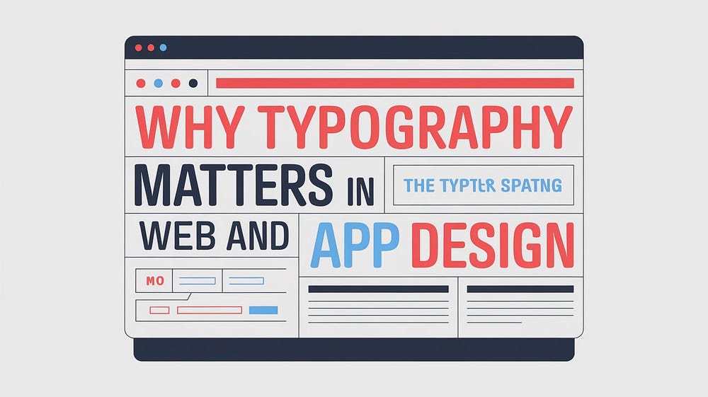
When it comes to web and app design, many elements contribute to the user experience (UX), from color schemes and layouts to navigation and imagery. However, one aspect that often goes overlooked is typography. Typography is more than just choosing a font — it plays a crucial role in shaping the user’s experience, conveying your brand’s message, and enhancing readability. In digital design, where users scan rather than read thoroughly, the right typography can make or break a user’s interaction with your website or app.
In this blog, we will explore why typography matters in web and app design and how it affects both the functionality and aesthetics of your digital presence.
Typography as a Communication Tool
At its core, typography is about communication. Every letter, word, and paragraph on your website or app carries a message, and the typography you choose influences how that message is perceived. The font, size, color, spacing, and alignment of text all work together to create a visual hierarchy that guides users through your content.
For example, bold, large fonts are often used for headlines to grab attention, while smaller, lighter fonts are used for body text to ensure readability. The visual contrast between headings, subheadings, and body text helps users navigate the page and understand the relative importance of different sections.
Choosing the right typography ensures that your message is communicated effectively and clearly. A well-designed typographic system makes your content easier to consume and enhances the user’s overall experience.
Establishing Brand Identity
Typography is a powerful tool for establishing and reinforcing your brand identity. Just like colors and logos, typography can evoke emotions and convey your brand’s personality. For instance, a sleek, modern font might be perfect for a tech startup, while a classic serif font could be more suitable for a law firm or luxury brand.
Consistency in typography across your website, app, and other marketing materials creates a cohesive brand experience. It helps users associate specific fonts with your brand, making your website or app more recognizable. By carefully choosing fonts that align with your brand values, you can communicate your brand’s personality before users even start reading.
For example, a bold, clean sans-serif font like Helvetica can convey professionalism and simplicity, while a playful, handwritten font might suggest creativity and friendliness.
Enhancing Readability and Accessibility
One of the primary functions of typography in web and app design is to enhance readability. Users should be able to read and digest the information on your site or app with ease, regardless of the device they are using. Poor typography choices — such as overly decorative fonts, small font sizes, or bad line spacing — can make your content hard to read, driving users away.
Readability involves more than just font selection. The spacing between lines (leading), characters (kerning), and paragraphs can significantly impact how easily users can read your content. For instance, if the line spacing is too tight, users might find the text cramped and difficult to follow. On the other hand, too much spacing can make the content feel disjointed.
Moreover, good typography also contributes to accessibility. Not all users have perfect vision, and some may have disabilities that affect how they consume content. By ensuring that your typography choices follow best practices — such as using legible fonts, ensuring sufficient color contrast between text and background, and providing scalable font sizes — you create an inclusive user experience for all visitors.
Creating Visual Hierarchy
A critical aspect of web and app design is creating a visual hierarchy that guides users through the content in a logical way. Typography is one of the key elements that helps establish this hierarchy. By varying font sizes, weights, and styles, you can indicate which pieces of information are most important.
For example, headlines typically use larger, bolder fonts to grab attention, while body text is smaller and more subdued. Subheadings help break up long sections of text and guide users through different topics. Emphasized text, such as bold or italic, can be used sparingly to draw attention to specific points.
This hierarchy allows users to scan your content quickly and understand the structure of the information at a glance. Without proper typographic hierarchy, users may struggle to differentiate between sections of content, leading to confusion and frustration.
Enhancing User Experience
Typography plays a direct role in the overall user experience. Good typography doesn’t just look nice; it makes the user’s journey through your website or app smoother and more enjoyable. When users don’t have to work hard to read or understand content, they’re more likely to engage with your site or app and take the actions you want them to — whether that’s making a purchase, signing up for a newsletter, or filling out a form.
For example, e-commerce websites rely on clear typography to guide users from product descriptions to checkout pages. Inconsistent or hard-to-read typography can result in cart abandonment or a higher bounce rate.
In mobile app design, where screen real estate is limited, typography becomes even more important. The right font size and line spacing can prevent users from needing to zoom in to read text. Additionally, typography must be responsive, adapting to different screen sizes without sacrificing readability or aesthetic appeal.
SEO Benefits of Good Typography
While typography is primarily concerned with user experience, it can also have SEO benefits. Search engines prioritize websites that offer a good user experience, and readable, well-structured text is a big part of that. Clear typography reduces bounce rates and increases the time users spend on your website, both of which are positive signals to search engines.
Additionally, using HTML tags like headings (H1, H2, H3) and emphasizing important text with bold or italicized styles helps search engines understand the structure of your content. When your typography makes your content easy to read and navigate, it not only benefits users but also improves your site’s SEO performance.
Conclusion
Typography is a vital component of web and app design, affecting everything from readability and user experience to brand identity and SEO. By paying attention to the fonts, spacing, and styles you use, you can create a digital experience that is not only visually appealing but also functional and engaging. Whether you’re building a website or designing an app, don’t overlook the power of good typography — it can be the key to setting your brand apart and ensuring a positive user experience.
At Tristate Designs, we understand the importance of typography in creating high-quality digital designs. Our team specializes in crafting web and app experiences that are not only beautiful but also functional and user-friendly. Contact us today to elevate your design with the perfect typography choices.